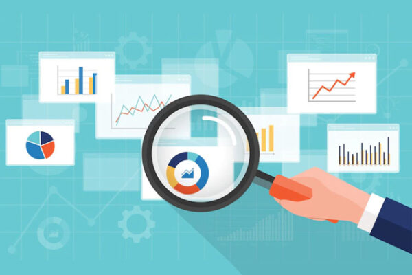
The business world cannot stop talking about dashboards – And Life Sciences companies are no exception. The Pharma space is known to have a vast number of systems – and rightly so because the job of bringing a drug to the market is not easy. In my experience, R&D is the most complicated, given the different processes and systems that are part of this huge function.
So, if we have dashboards that sit on top of these multiple systems and data stores and provide a summarised view, it must be an excellent value add for the executives to use those dashboards. And that’s why it becomes more important for them to have an effective reporting strategy so that they need not spend on maintaining dashboards that people are not using.

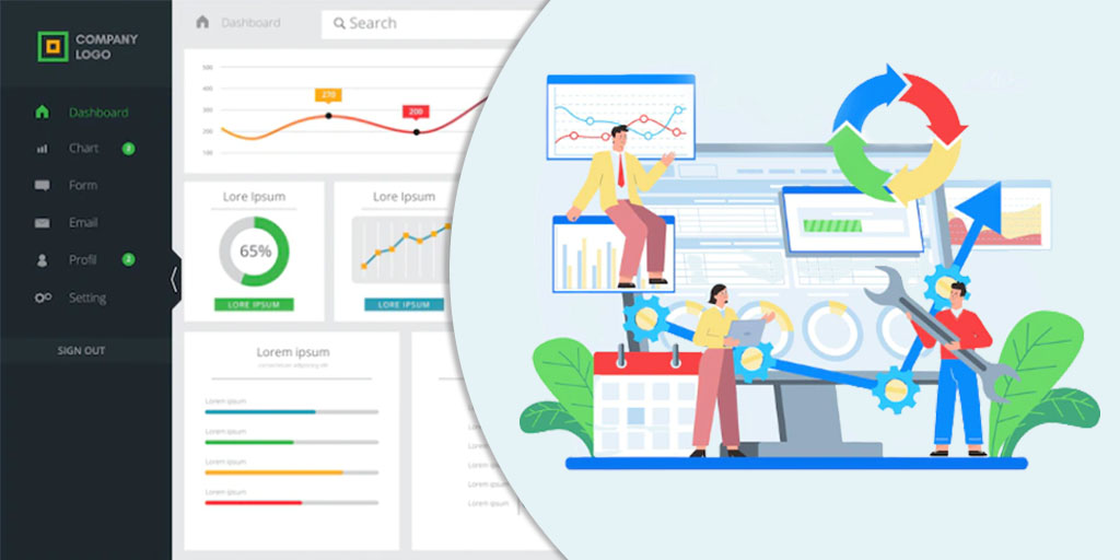
Approach to Building a Dashboard
Dashboards are not all magic though – companies are struggling either with too many or too few of them, lack of adoption questions from users on What this means on the dashboard, etc., and we are left to wonder – What is it that we can change?
Let us look at the steps in building a dashboard – People mostly follow the agile way now. A business function that reaches out to the analytics team in their function and asks them to put together a dashboard. Post some discovery sessions on what they need, and the analytics team builds the dashboard for them, keeping in mind their main requirements – either by themselves or in partnership with an analytics vendor partner. Once ready, it is sent out for User Acceptance Testing(UAT), where the business function tests the dashboard, sometimes using test scripts and sometimes not, and gives the go-ahead to publish the dashboard.
Steps to Building a Dashboard
The biggest challenge that is usually seen is the assumption that reporting strategy of a function is a data problem. If we have good data, then we will have great dashboards. However, I wanted to introduce a different line of thought on how we could potentially approach the problem of building effect dashboards – Not just look at it from a data dimension but a mix of data, people, and process.
1. Create a Robust Framework for Discovery and Find a Way to Capture Context
It is hard, we understand, Dashboards are sometimes built for cross-functional teams, and it is extremely hard to build something that works for everyone. However, if we have a clear framework in terms of interacting with users, we can collect information as to what is important for them without necessarily starting a debate. People do it through the user story collection method, as is present in the agile process, but it covers only half the story. Let us take an example. A typical user story is structured as follows:
“As a [persona], I [want to], [so that]
It captures who the person is(role), what they want to do and what they want to achieve. What it misses out is –
- What action do they need to take to achieve the outcome?
- And to take action, what supporting data do they need?
What they did to achieve the outcome is important because it will tell you if insights are leading to actions and actions are leading to correct outcomes. This context becomes especially important when you want to move up the analytics value chain – create analytics that is more predictive and prescriptive vs being descriptive
Dashboards often end up being a combination of some relevant information for the user and some information that others thought may be useful to the user.
It is particularly important that all elements we put on the dashboard are relevant and important to the user and not because of some default software setting or the person building the dashboard. As discussed, if we stick to a framework that has the how together with the who, what, and why it will ensure that only what is relevant gets put on the dashboard.
2. Arrange the Information in a Logical Way
Once we get all the relevant discovery information, let us arrange the information in a logical way. This arrangement is important, keeping the 5-second rule in mind. Any user should be able to get the information that they need in five seconds.
The most important should go on the top or what we call the executive layer, and then comes the diagnostic layer – Why are the metrics what it is, and, in the end, you have the details.
There are many ways to play around with the layer – Have all of it together, have one combined executive dashboard, and then redirect to the diagnostic and details based on what they are looking for – This will be specific to the organization.
3. Change the User Interaction Process for User Acceptance Testing
Send small builds out to a small sample of the user rather than waiting for the entire dashboard to be done. That way, if the user is happy with just two pages on the dashboard and you have built four in anticipation that they will need all that extra data, you will know much before you waste time in building them.
Or better still, create an interactive dashboard prototype – And the dashboard prototype should not be created in a Visualization Tool. It should be created with minimum effort to get user feedback.
It is necessary to watch a sample of the user conduct the User Acceptance Testing (UAT) and walk you through their thought process as they open the dashboard vs. sending the dashboard to the user and asking them to put feedback into an excel sheet. Most of the UATs we have conducted are when we send the dashboard to the users together with a UAT document or test scripts. Watching users in action as they test the dashboard will allow you to capture the experience and see how it will integrate with the business process of the stakeholder group.
When you are with the user, and the user is navigating through the dashboard, you will see there are portions of the dashboard or visuals that they do not go to at all. That will never surface if you send them an Excel document to enter the UAT. And the information is useful because it tells you what you do not need and allows you to remove clutter.
4. Design Should Not Be an Afterthought
Though everyone keeps talking about well-designed dashboards in the world of creating dashboards, design is still an afterthought. Courageous are the organizations that put design before development.
There are distinct reasons why design comes after development –
- The timeline for getting the dashboard out is so short that the general thought is if we put extra effort into design, it will delay the release. And the thought process is – let us do the basic minimum and get the dashboard out.
- The second is user comfort – Give it to me like how it used to be before.
- User Familiarity with the Tool – If the visualization tool is being newly introduced, then users want the “old Excel or old PowerPoint” look and feel, and it is hard to convince them sometimes, especially if the user belongs to the senior and executive layers.
On the other side, you also have those who take a design to another extreme by putting fancy and complicated charts (think of the box plot or even the pseudo pie charts!) when a simple chart can answer the same question.
It is essential to efficiently balance the seesaw of design and reach a common middle ground that is minimalistic-ally relevant.
5. Publish is Not the End
Pushing a dashboard into production is often treated as the equivalent of scoring a goal. Organizations must realize that a dashboard in production is just one milestone in the success journey. After that comes, the most important part of ensuring the dashboard is adopted well to changing business environment so that all the money that was spent on building the beautiful dashboard is justified.
Dashboards Are and Need to be Dynamic

Any dashboard is a breathing product that needs to continuously adapt itself to changing business needs, otherwise, it would become just one more dashboard in the list of a hundred that you may have.
Having a strategy that covers the frequency of review of usage data, what kind of usage data should be monitored, surveyed, and occasionally met with a sample group of stakeholders to answer the most important question – Is the dashboard still relevant to their decision-making process?
The objective of no organization is building more dashboards – they want to build minimum but a set of solid exhaustive dashboards that allows their stakeholders to make decisions and act.
Redefine Your Dashboard Development with DefineRight
At DefineRight, we have frameworks that look at dashboard development in a new way. Things will change when we start looking at building dashboards as not just a data problem but a mix of data, people, and processes – the share of each could be different and specific to an organization. A well-designed discovery and delivery framework for building a dashboard can ensure that you have a clean design with minimum visuals that can take the user from information to action to decision to an outcome. After all, is it not what a dashboard is all about?