
You could have spent years in the data and visualization world and think that you have been there and seen all, but reading Stephen Few’s book Information Dashboard Design you will be very embarrassed. It happened to me the first time I read it. Every time he gave an example of what not to do, I thought of all the places where I had done exactly that. Made me cringe!
You will have to read the full book to get the most out of it, but in this blog, I wanted to list the top mistakes that I made in designing dashboards. Instead of mistakes, I would call them lessons that I learned.
Lesson 1: Understand the Context and Do Not Create Overload on Your Users’ Brain
Not taking the time to ask enough questions during discovery. This is because we usually assume when we hear a familiar problem that we have done it before.
In the clinical operations world, keeping track of planned vs. actual enrolment is an important metric. Most organizations have dashboards and charts in place that show their study teams the planned Vs. Actual enrolments. I have developed graphs like the following to show the difference between the plan and actuals.
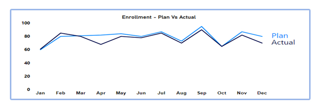
This is an example of what Few refers to as a Deficient measure. A measure is deficient if it isn’t the one that most clearly and efficiently communicates the meaning that the dashboard viewer should discern.
For example, if the dashboard user needs to know what the variance between the actual and planned enrolment is, then it would be more direct to simply express the variance rather than showing the planned and actual numbers and leaving it to the user to calculate the difference in her head.
A better representation would be a graph that is designed to emphasize the deviation from the target.
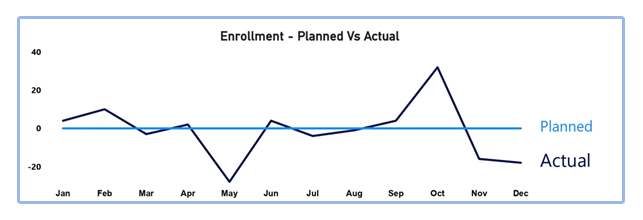
If we spend a few minutes extra asking the user how she intends to use the information, we can create visuals that have more context and don’t create a brain overload for the user.
Lesson 2: Fragmenting Data into Multiple Screens or Using Scroll
Sometimes we fragment the data into multiple screens or even within the same screen and give users navigation action to go to the different fragments. There are dashboards today that support the storytelling format and give vertical scrolling.
Another problem in dashboards is when users need to scroll to access all the information on the page. People often assume that anything that lies beyond their immediate field of vision and requires scrolling is less important than what is there in their immediate vicinity.
The problem with this is that you lose the one most important feature of a dashboard – which is a simultaneity of vision – the ability to see everything at once, which is essential for the decision-making process.
Lesson 3: Arranging the Data Poorly
Dashboards often need to show a large amount of information in a limited space. If the space is not used properly in terms of where you are placing the information, then the result will be a cluttered mess. It should be arranged in such a way that the most important data needs to stand out. Data that needs immediate attention should be prominent.
In a lot of dashboards, I have seen the prime real estate used to display company logos or controls for navigation and data selection or the name of the dashboard. In arranging information, keep in mind the following:
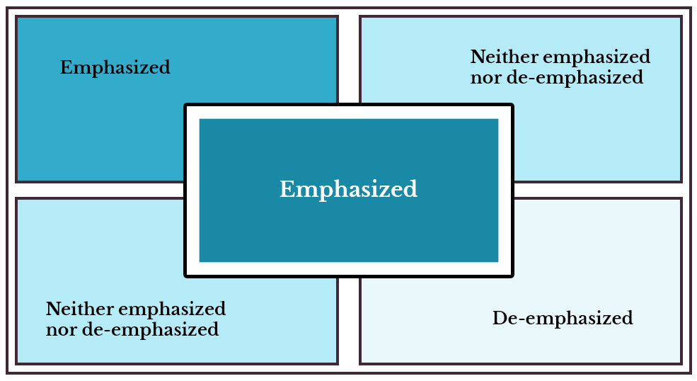
The layout is structured to leverage the fact that people use z-pattern scanning for pages that are not centered on text. When people first look at a dashboard their eyes go to the horizontal line across the top of the page. This could be because we often place the menu bar or the filters there or it could be due to the simple habit of reading from left- to- right from the top.Once they finish scanning the top and go to the end the eye comes down an left similar to the middle line in the letter Z. When the eye reaches the end it goes left and repeats a horizontal line across the lower part of the page. – All the information that you need to emphasize needs to go into the area highlighted as “Emphasized.”
Lesson 4: Displaying Excessive Detail

Displaying numbers with decimal points or timestamps in the seconds format or giving too many columns in the table are all examples of excessive detail. The level of detail that you use depends on the context of the data. For example, if you are showing enrolment dates, then it is not important to show the date with a time stamp though the system may offer it because users are not interested in that level of detail.
Lesson 5: Cluttering the Data with Useless Decoration
Edward Tufte came up with the concept of data-ink ration in his 1983 classic The Visual Display of Quantitative Information. In his book, he says that when quantitative data is displayed in printed form, some of the ink that appears on the page presents data and some presents visual content that is not data (a.k.a. non‐data).
When you are designing a dashboard, your primary motive is to maximize the data-ink ratio. One easy way to do it is by eliminating all non-data pixels like:
- Graphics that serve only as decoration – Sometimes, some dashboards show images that take up much of the prime real estate and often do not add much value.
- Variations in the color that don’t encode any meaning – Unless we use the same country- color coding as the graph on the left for all the rest of the graphs on the dashboard multi-color graphs are an overload for the eyes.
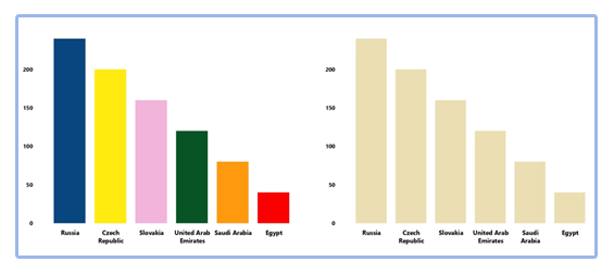
- Unnecessary borders around sections of data
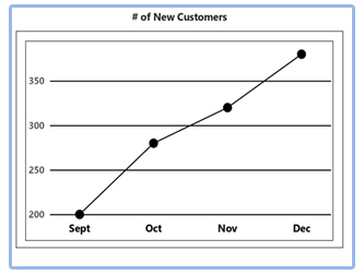
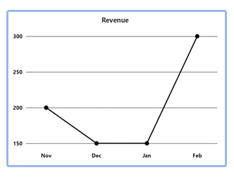
- Grid Lines in Graph – Grid Lines are great for when we are designing the dashboard to ensure alignment. However, it is of no use to the user of the dashboard.
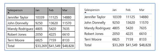
- Borders Around Visuals

Dashboard Design and Customization from DefineRight
I am sure a lot of these are familiar to a lot of us, but the question is, when it comes down to implementing these, how many of us have been able to push back and hold our ground? The reason for that could be anything ranging from what the users want, short development timelines not allowing us to focus on design, limitations of the tool itself or limited understanding of what the tool can do, and Business Intelligence Software Developers that may not have design training. To make dashboards more effective, things need to change – If we could have a design checklist before dashboards go live, that will ensure that we build in design in what we are developing as a natural process.
And the truth is if we take some extra time, in the beginning, to understand how the data is going to be used, then we can design (and not just build) dashboards that can be much more beneficial to the user.
At DefineRight, we use our analytics discovery framework to understand the context and ensure that only what is most important goes into the dashboard, keeping the design best practices in mind. We believe in keeping the noise out and letting the data speak for itself. Everything else is clutter.
